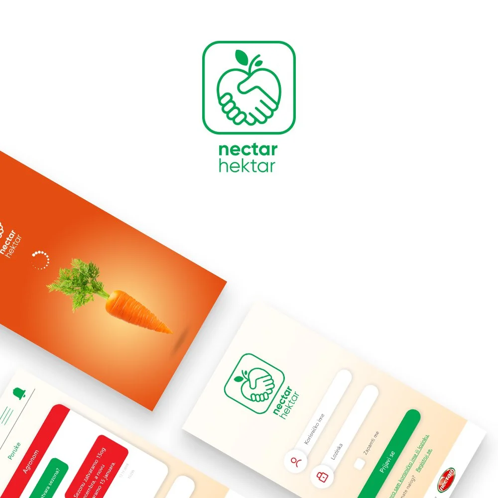
Nectar Hektar
MOBILE APP
Client: Nectar
Role: UI designer
Project duration: 2 weeks
The idea
As part of the digitizing agriculture & orcharding project, Nectar came up with the idea to develop a mobile application. The first phase would digitize the process of communication and paperwork between fruit/vegetable producers and the Nectar company.
The wireframes
I received the low-fidelity wireframes from the UX designer. My job was to make a compelling and engaging UI that was simple and easy to use.
Nobody likes bureaucracy and long waiting lines.
The whole idea of the app is to unite all necessary paperwork in one place and allow the users to fill up everything online from their phones, and if needed contact Nectar agronomist all from one app.
The sign up
The app is for two types of users: farmers and firms. That’s why upon first launch the user is prompted to select the appropriate category for sign-up.
Target audience & app screens
As the primary group of users is 45+ years old and their interaction with technology in many cases was limited to only necessary tasks they had to do, the design emphasis was placed on simplicity and clarity to facilitate use by all ages and digitally literate groups. Graphical elements are reduced to very large icons with large fields and text for this purpose.
Creating a visual system
Designing a digital product from its conceptual and turning it into something that is a mature and polished product involves a certain level of standardization, organization, and communication that is consistent with the brand. As the Nectar Hektar app was a project of multiple teams it was necessary to create a style guide that would bring cohesion to the app interface and experience.
Conclusion
This is one of the first apps I ever made, it was a great experience working with big local companies and different teams from concepts to development. As I learned about agriculture & orcharding I also expanded my knowledge about UX and Adobe XD as a tool.