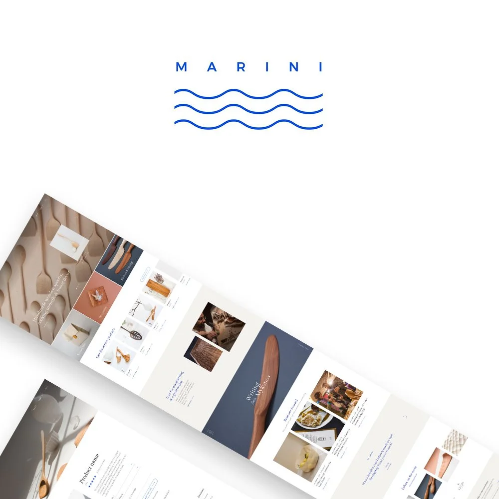
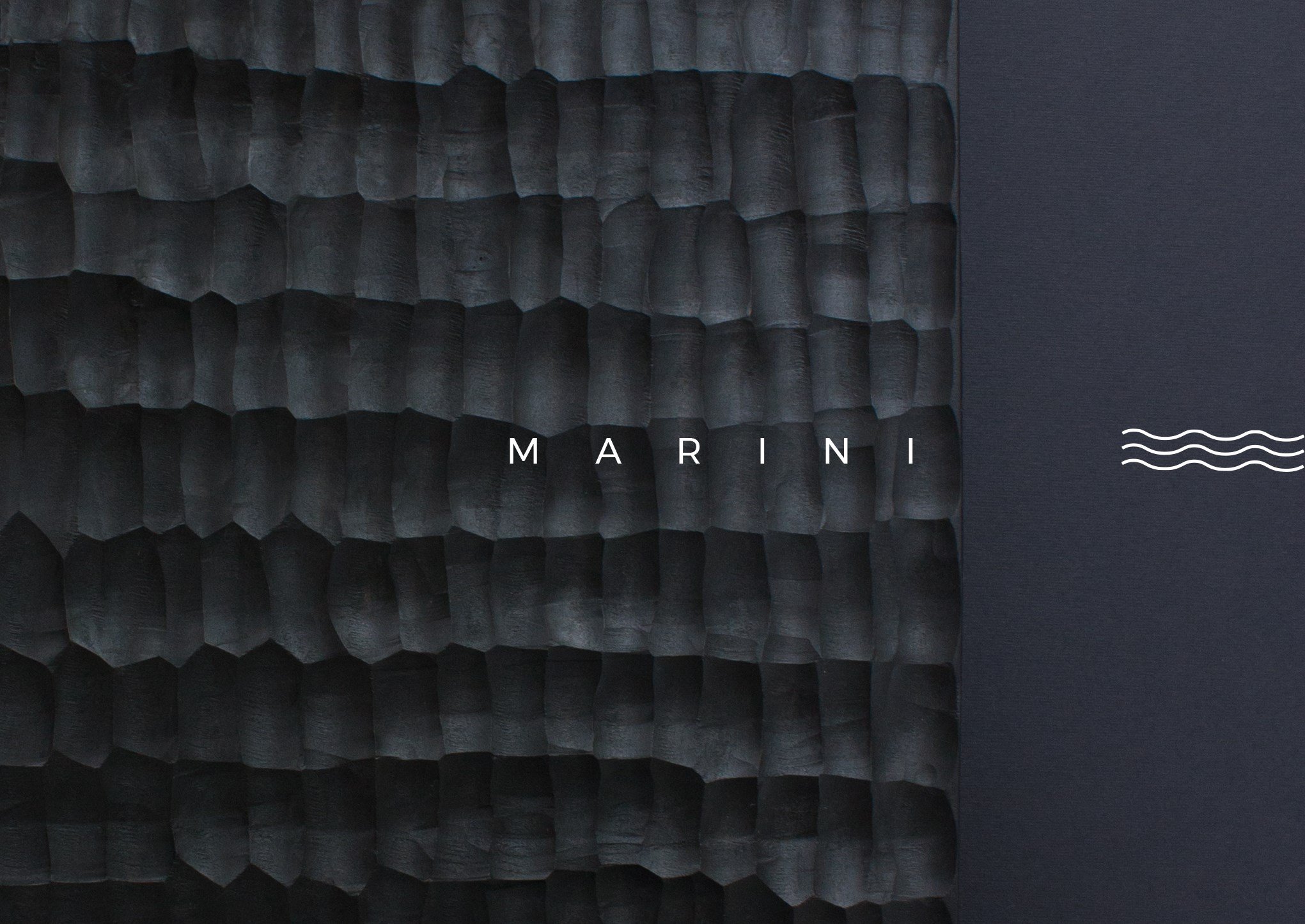
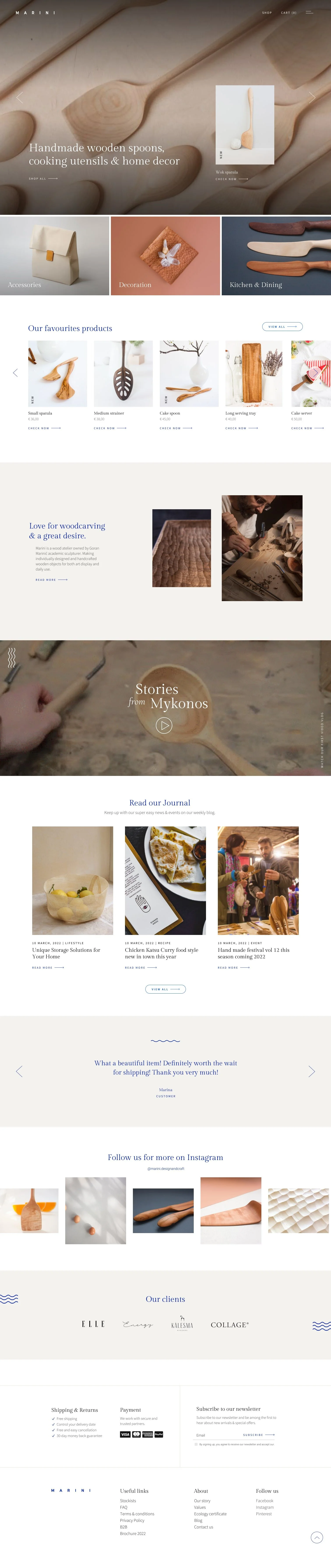
MARINI DESIGN AND CRAFT
DESKTOP WEBSITE
Client: Marini Design&Craft
Role: UI/UX designer
Project duration: Ongoing
Introduction
A team of five passionate designers has come together to create Marini Design and Crafts, an e-commerce platform dedicated to unique, handcrafted wood products. Combining expertise in UX/UI design and branding, the team’s goal is to build a visually stunning and user-friendly website that showcases high-quality, artisanal creations. With a focus on aesthetics, functionality, and seamless shopping experiences, Marini Design and Crafts is set to become a go-to destination for handmade and custom-designed goods.
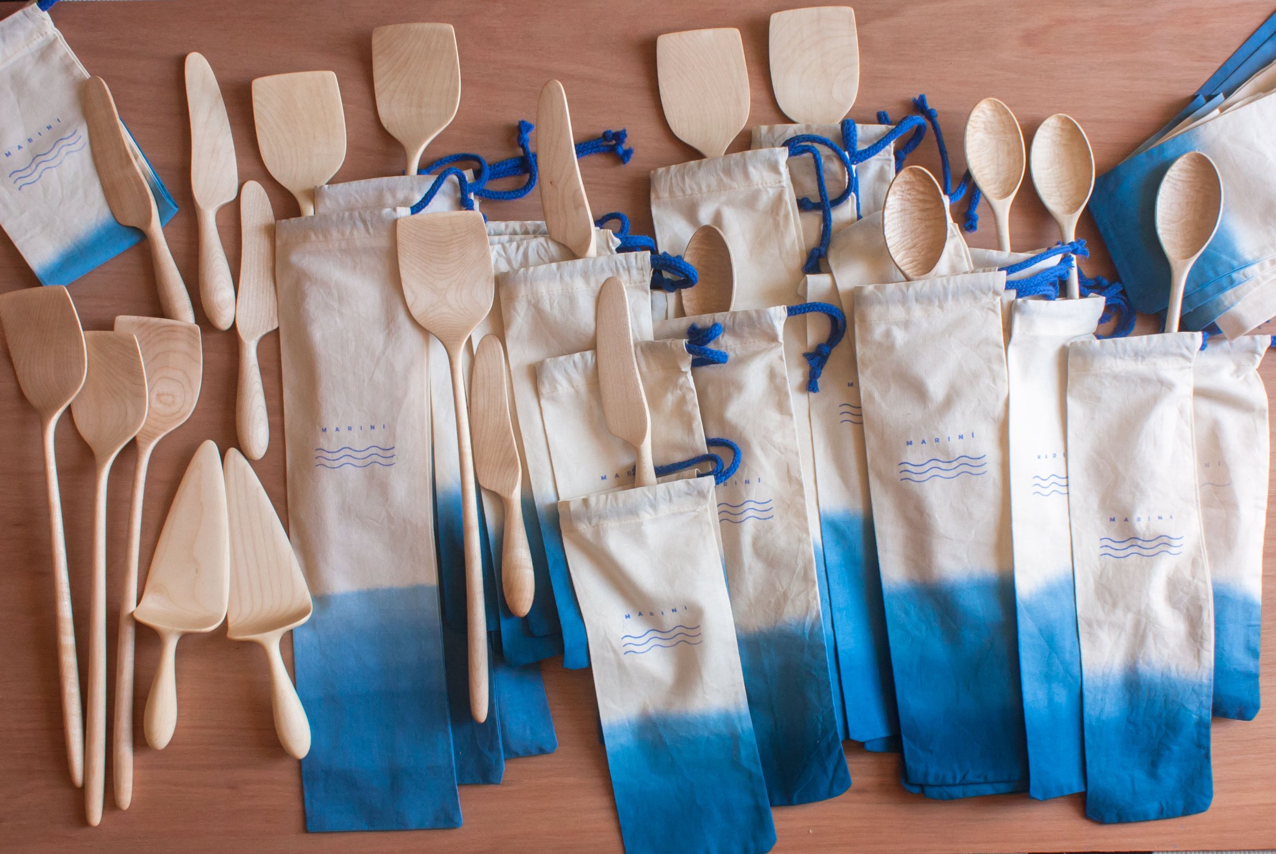
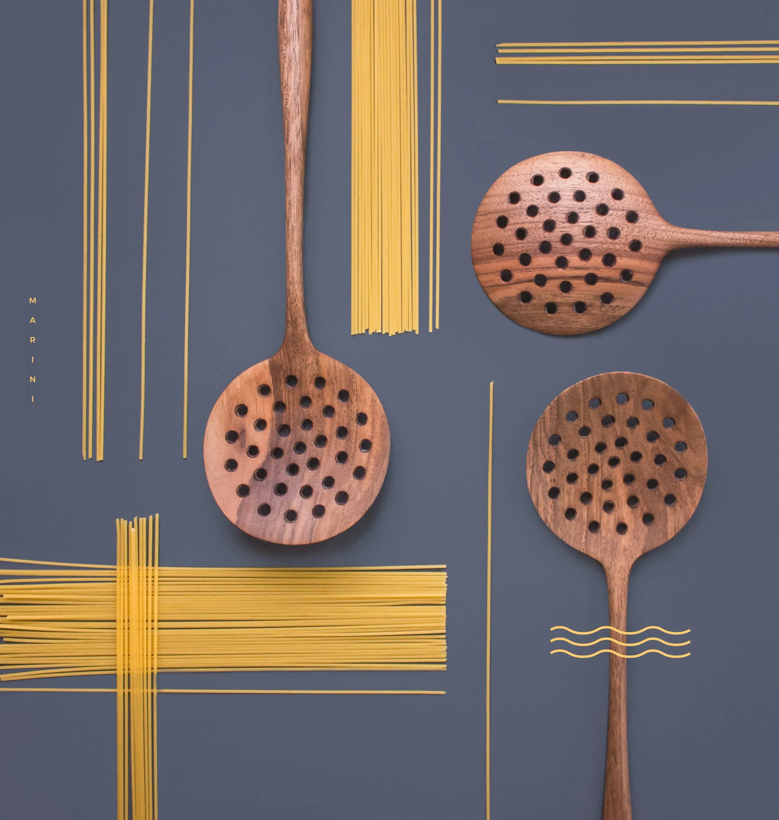
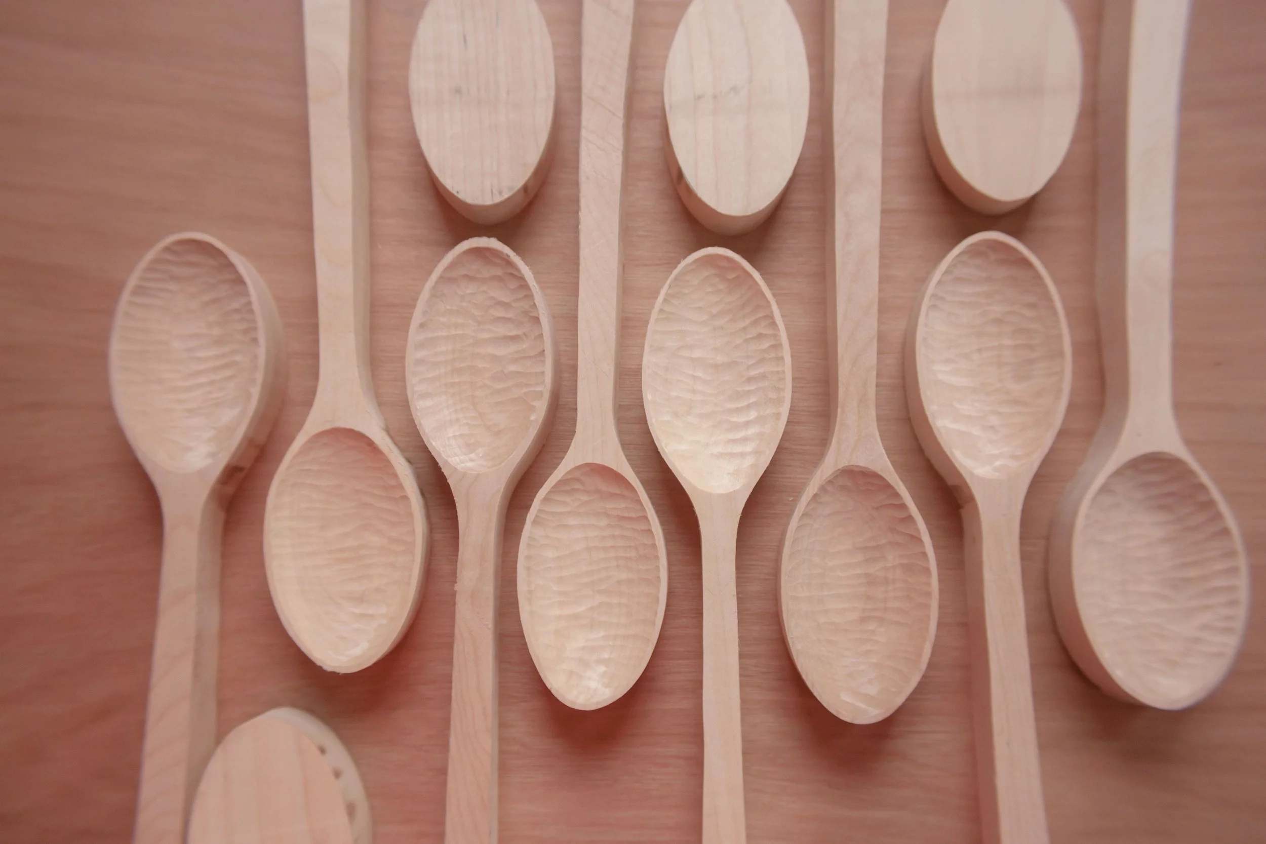
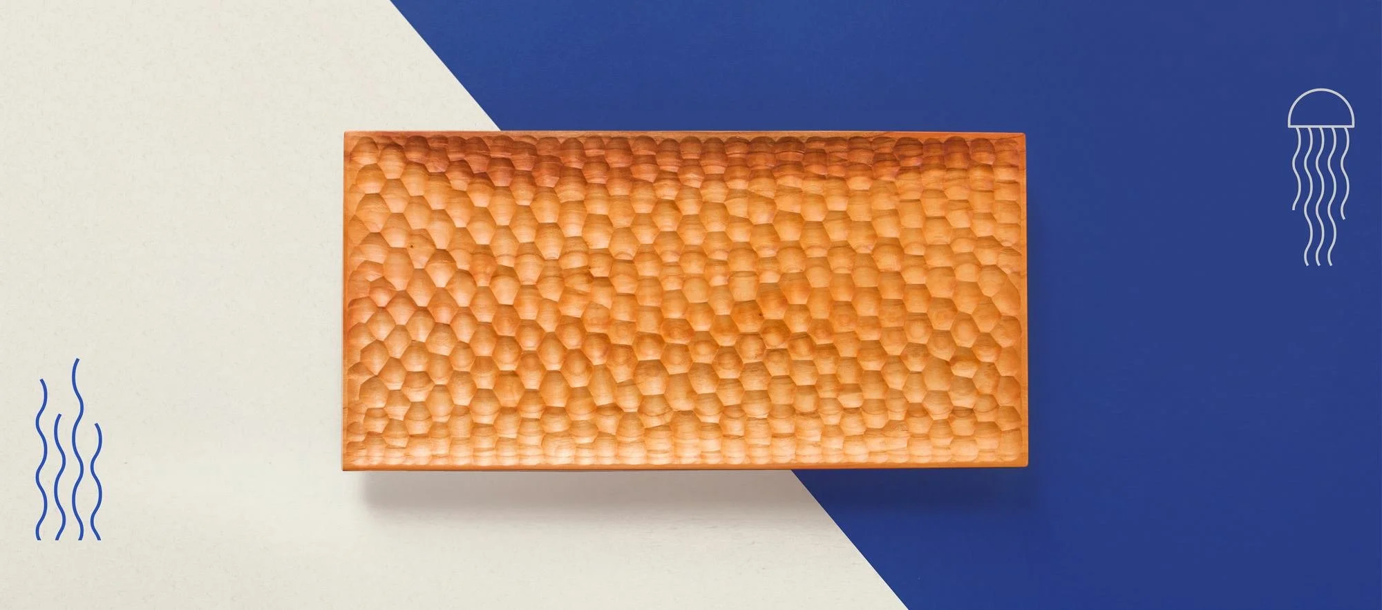
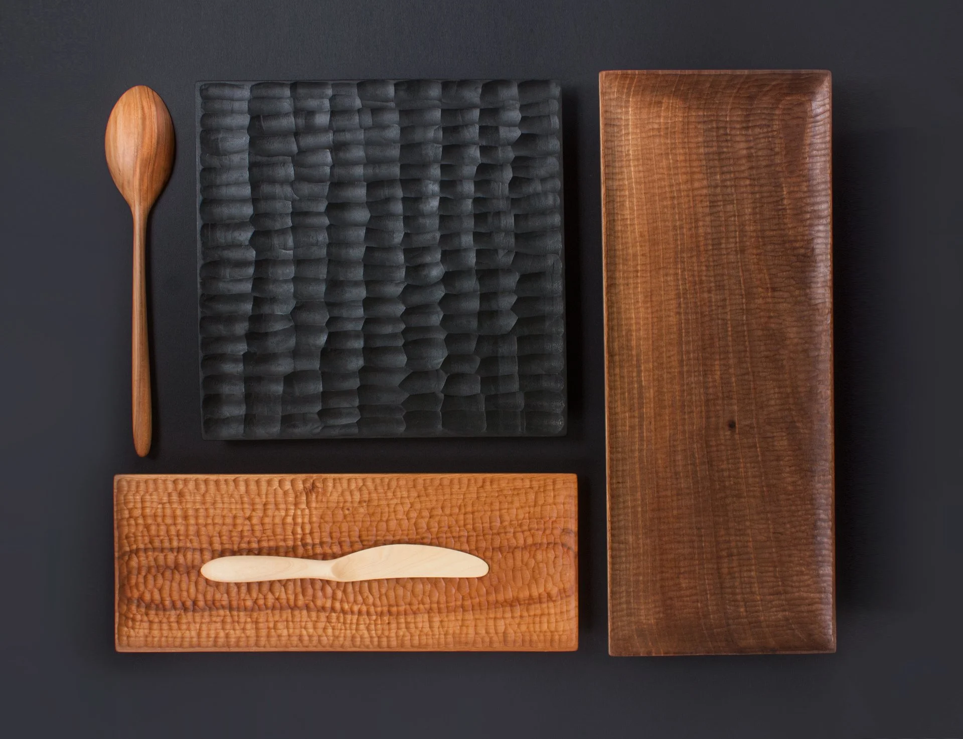
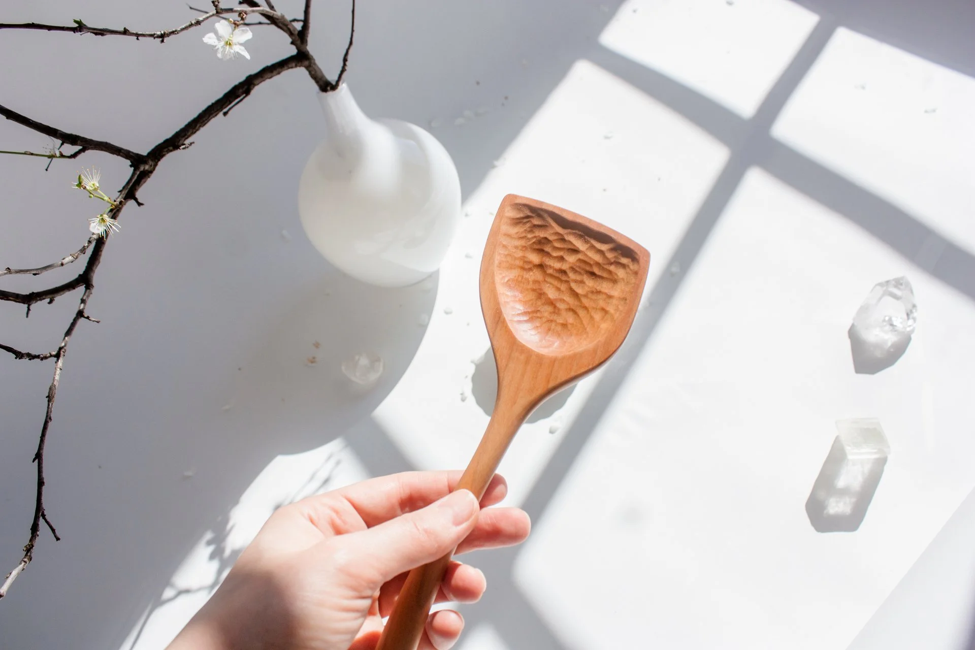
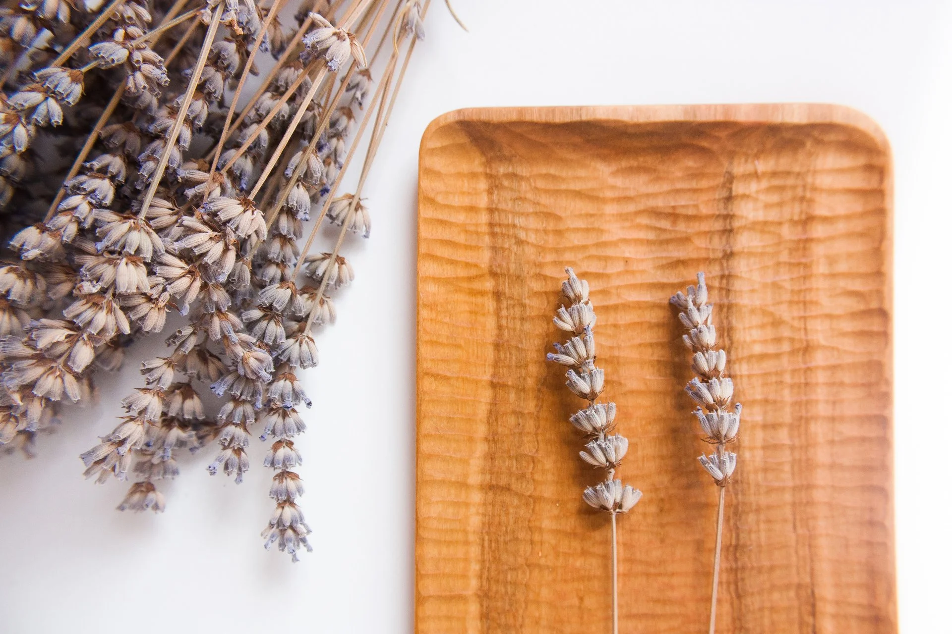
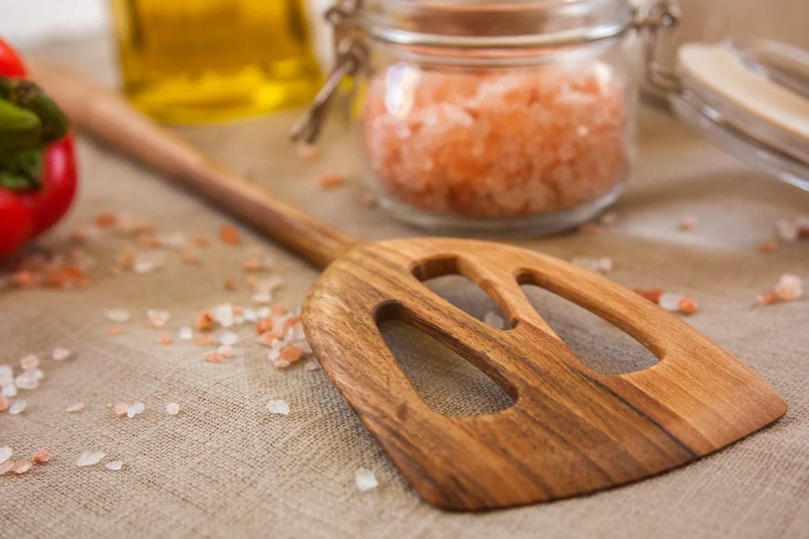
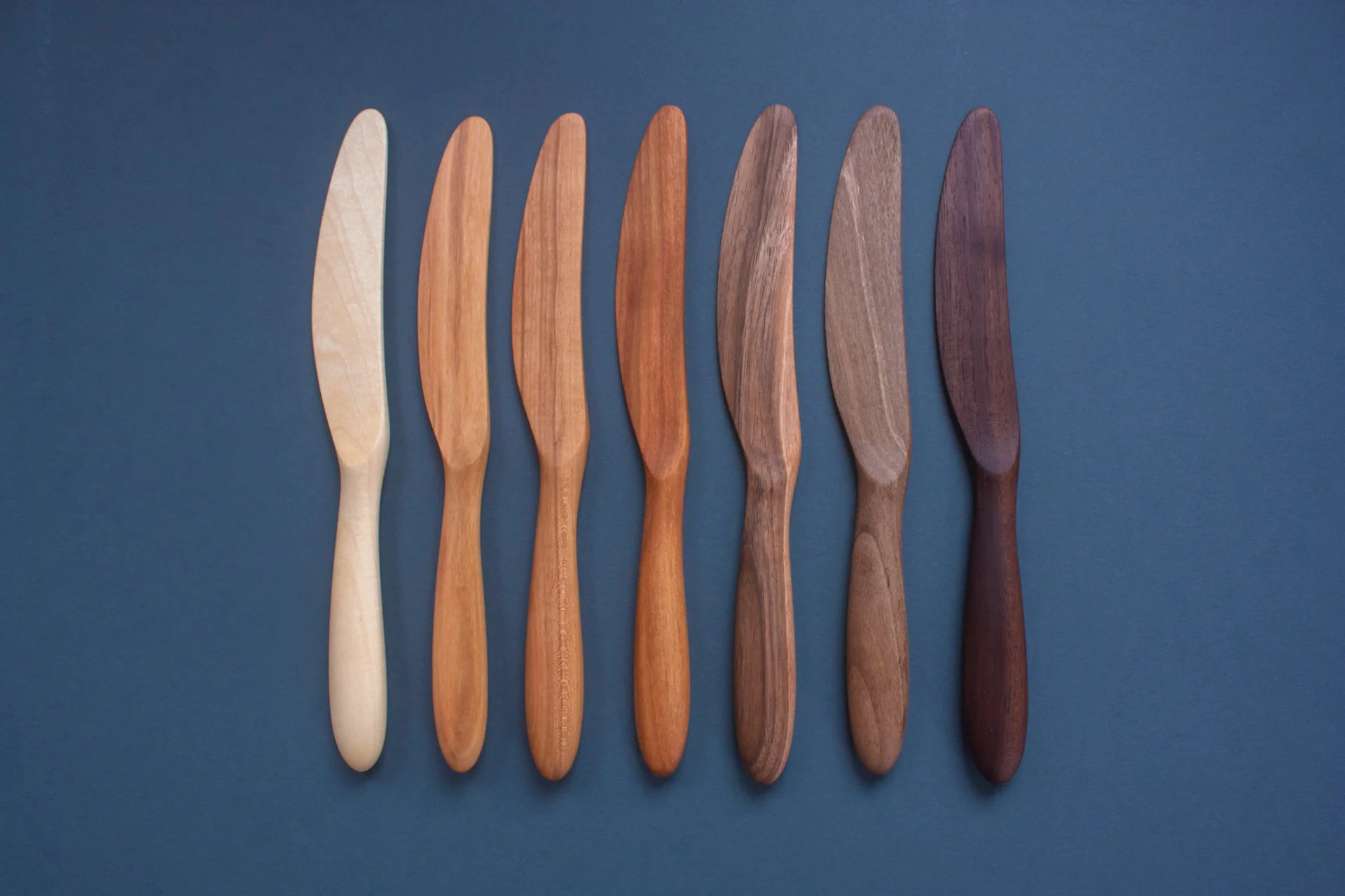
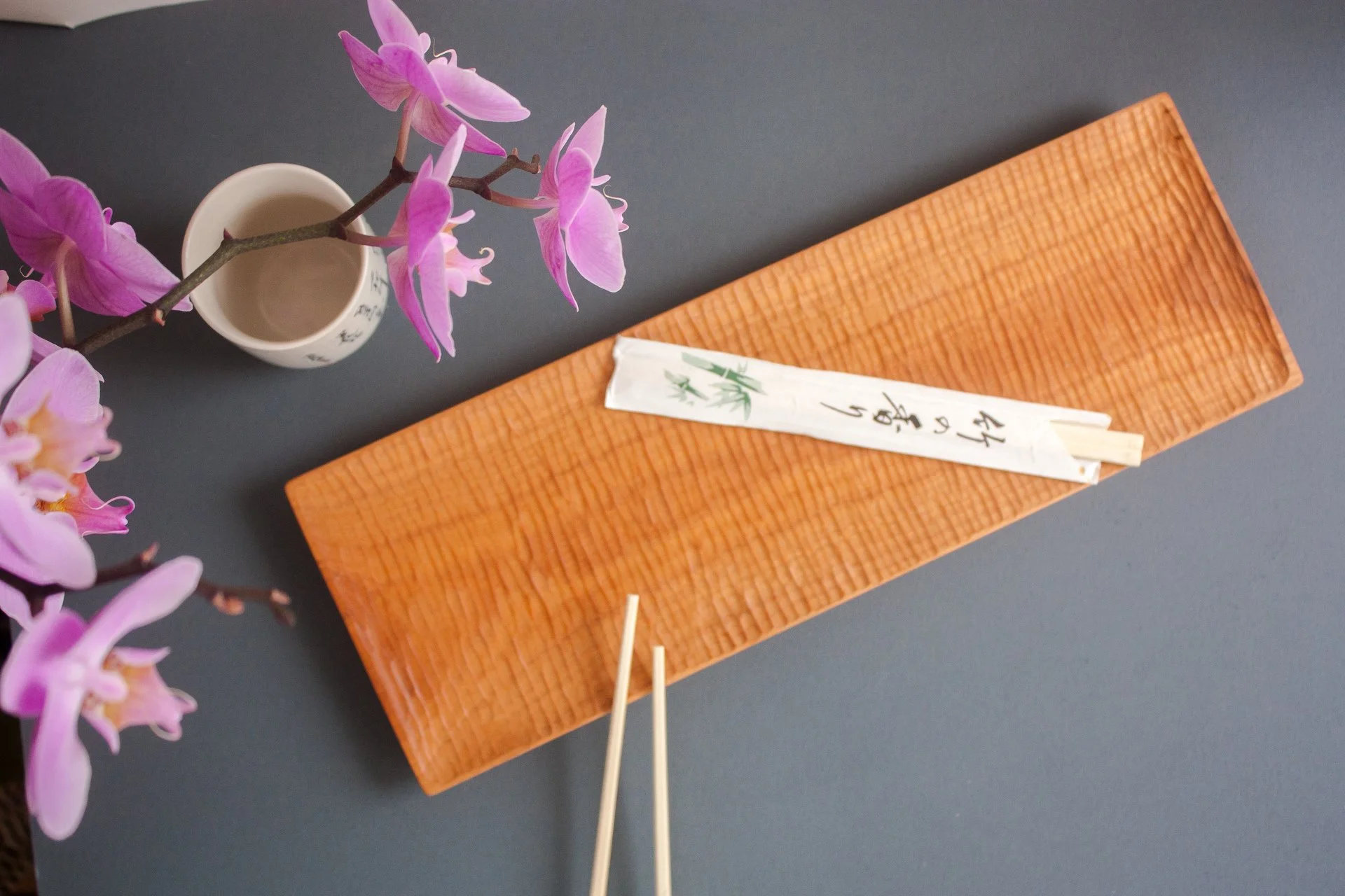
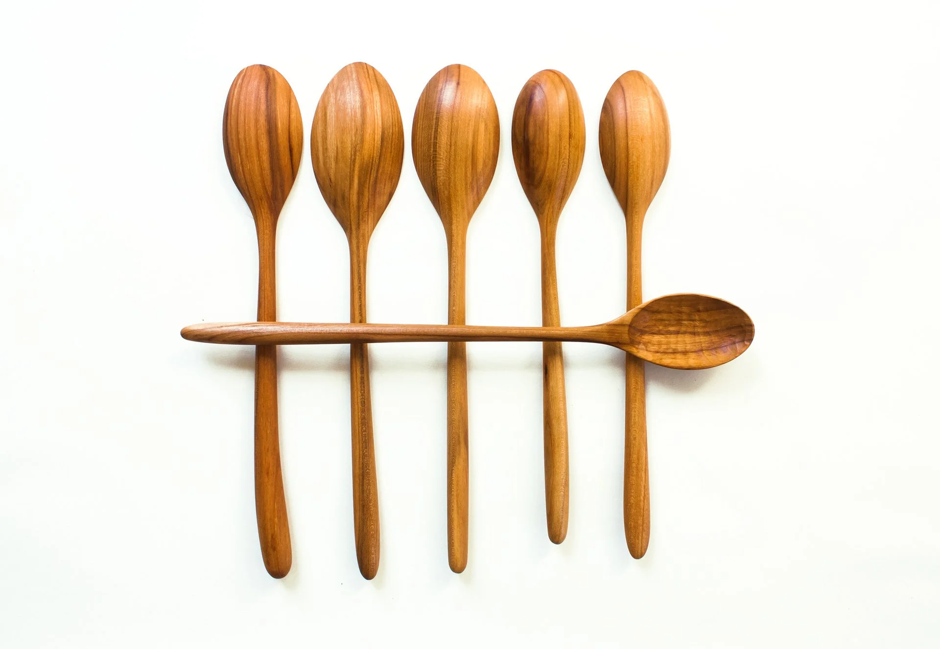
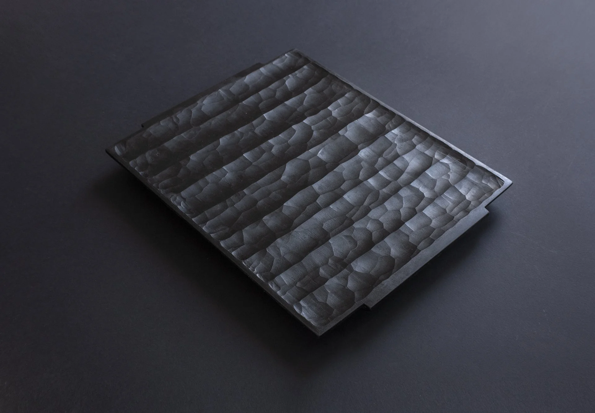
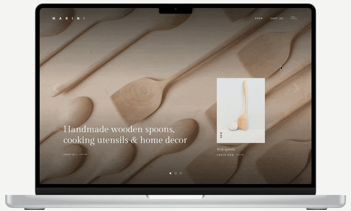
As you scroll through the case study you can see the official Marini product shots we used in the making of the website.
About the brand
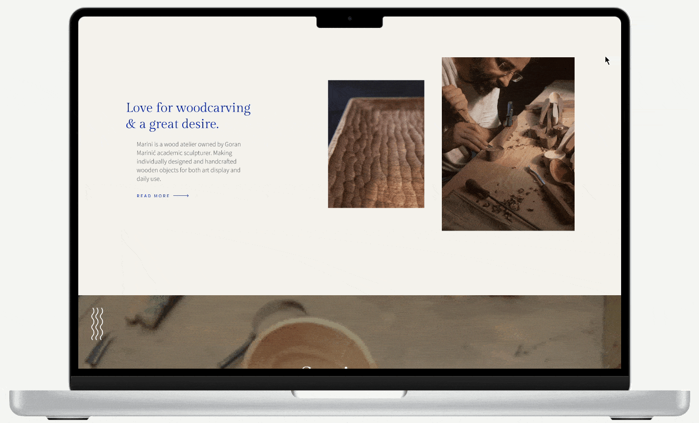
Marini is an art studio owned by two artists, Goran and Jelena Marinić. Their love for woodcarving grew into a great desire to create beautiful and useful things. They make individually designed and handmade wooden objects for artistic display and everyday use.
Handcrafting piece by piece, they give it their full attention and love. They believe that design should be discreet and functional, an object useful to man, an object of lasting beauty. They use only ethically sourced materials from small local farms, based on the principle of cutting down old trees and planting new ones instead.
The challenge
The current website features only blog posts and galleries of products but without the option to buy from the website.
Our job was to create a completely new e-commerce website.
Some of the features the owners wanted to have: customizing and tracking the orders, a way to filter the items, a newsletter, an integrated Instagram feed, a unique and minimalistic design, a blog page, a review section, and featured product specifications and instructions for care.
Research
Target audience, who is the buyer?
Owners already had the statistics of the average buyer, some of the highlights are:
The main buyers so far were concept stores, architects, and culinary enthusiasts. The average buyer age is 30 to 52, they are mostly from the US and UK.
Most bought items are cooking utensils, strainers, and black trays.
The customers were mostly coming from the Marini Etsy store and Instagram.
The main things that attract customers are the design and materials of Marini products, the buyers also recognize Marini as an ecologically sustainable brand.
Survey
As a team, we conducted additional research to better understand the target group. We created an online survey using Google Forms. We wanted to know how much customers care for the premium custom-made aspect of Marini products, does ecology sustainability matters to most of them, and whether they find handmade cooking utensils good as a gift for someone.
Participants were given 10 questions to answer, for the context they were given a brief description of the Marini store with some pictures of products.
We managed to get 44 people to answer our questions. The participants were old customers and potential new ones that showed interest in handmade products.
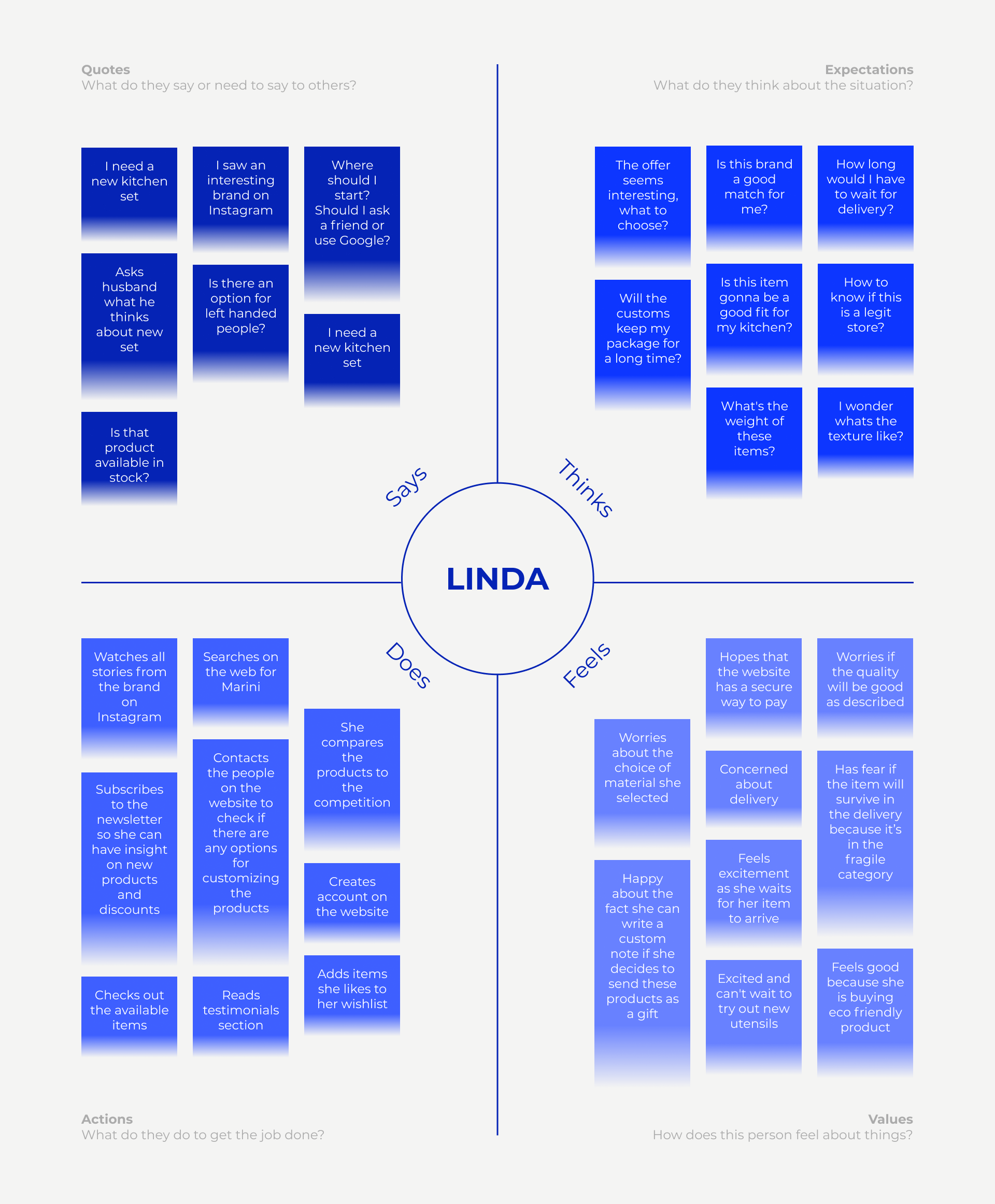
User persona
With the newly gathered data, we moved on to making a persona that would unite the findings and give a face to our customers.
Empathy Mapping
As UX professionals, it is our job to advocate on behalf of the user. However, in order to do it, not only must we deeply understand our users, but we must also help our colleagues understand them and prioritize their needs. Empathy maps, widely used throughout agile and design communities, are a powerful, fundamental tool for accomplishing both.
Card sorting
To help us visualize and evaluate informational structure we used the card sorting method. We organized topics into categories and labeled everything by priority.
User journey Mapping
We created a journey map as a visualization of the process that a person goes through to successfully order items from the Marini webshop.
User flow
We outlined the user’s movement through the Marini website and mapped out every step the user takes—from the entry point right through to the conversion.
Sitemap
Before we started drawing the first wireframes, we created a sitemap to clearly outline our goals by deciding exactly what we wanted from the site and then mapping it out.
Wireframes
Everyone on the team created countless versions of wireframes, we decided to take parts from several drawings and make one unified that we thought give the best UX and properly described Marini as a brand.
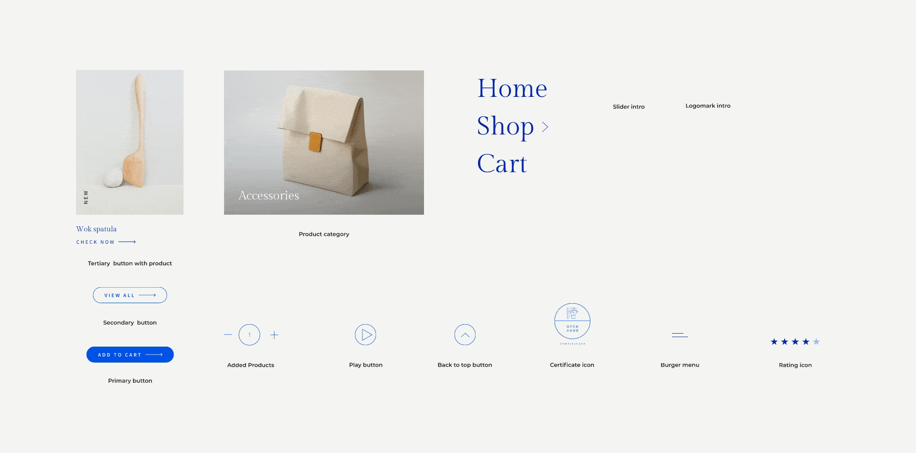
Style guide
One of the ways to ensure that the team is on the same page when designing separate parts of the website is to create design documentation or a web design style guide.
We wanted to achieve a cohesive experience among different pages. Also, the guide helps to ensure that future development or third-party production will follow brand guidelines and will be perceived as part of the overall brand.
Design &
prototyping
As a team of designers, the part we all waited for the most was of course the UI of the website
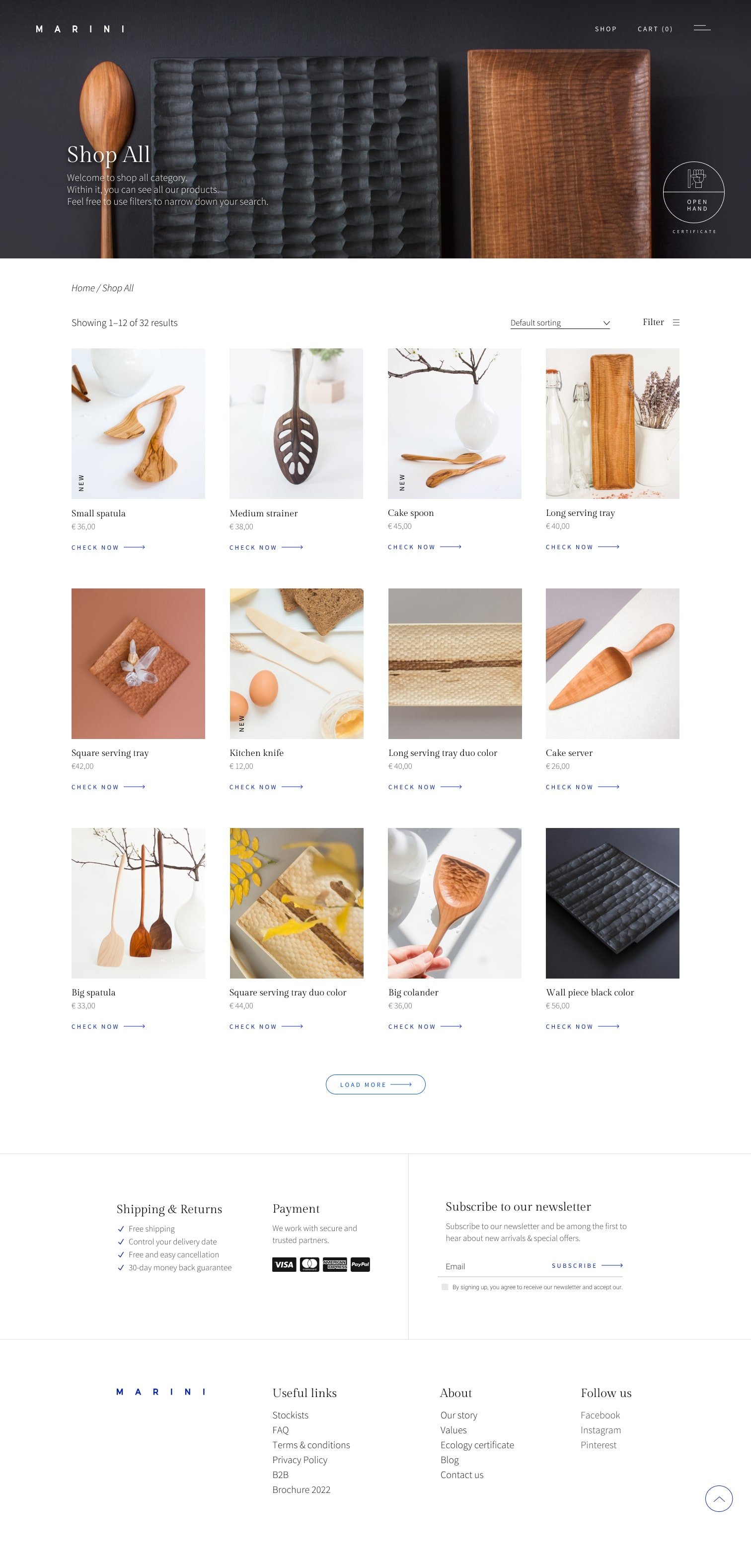
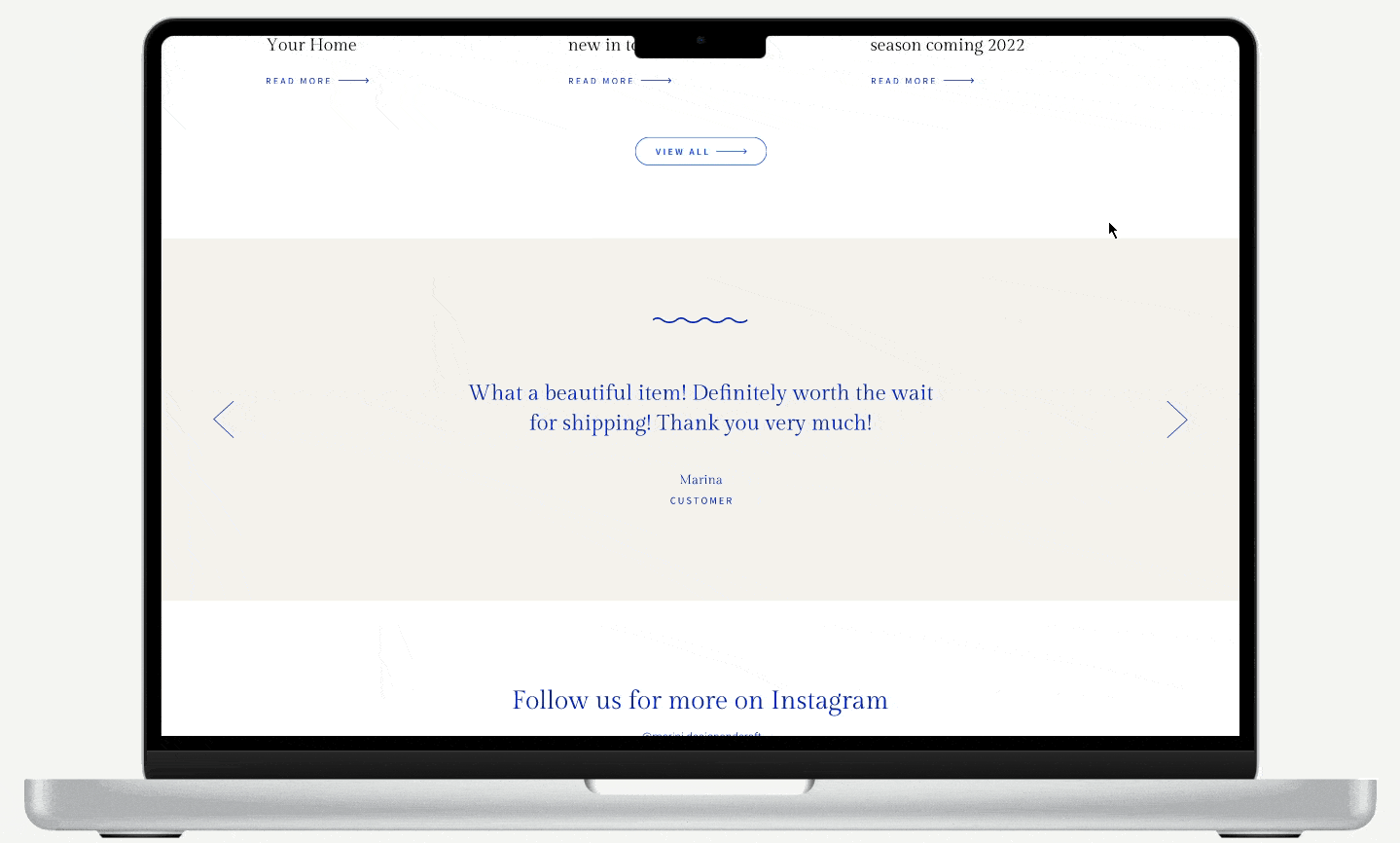
Homepage
Browse products page
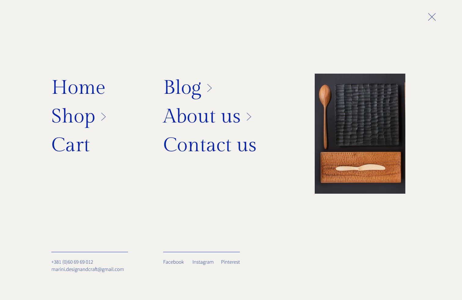
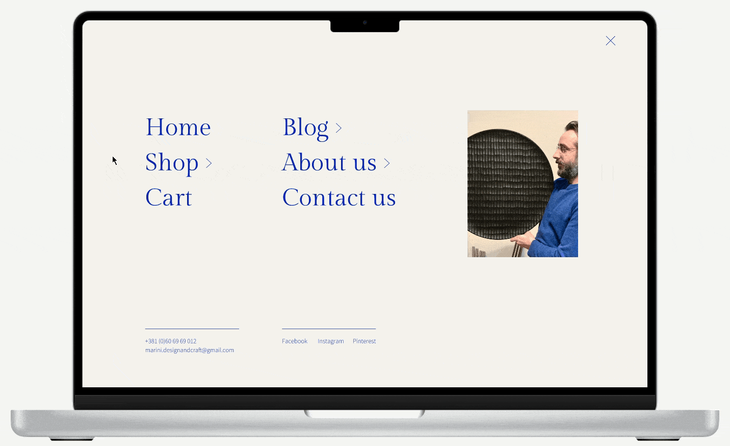
Burger menu
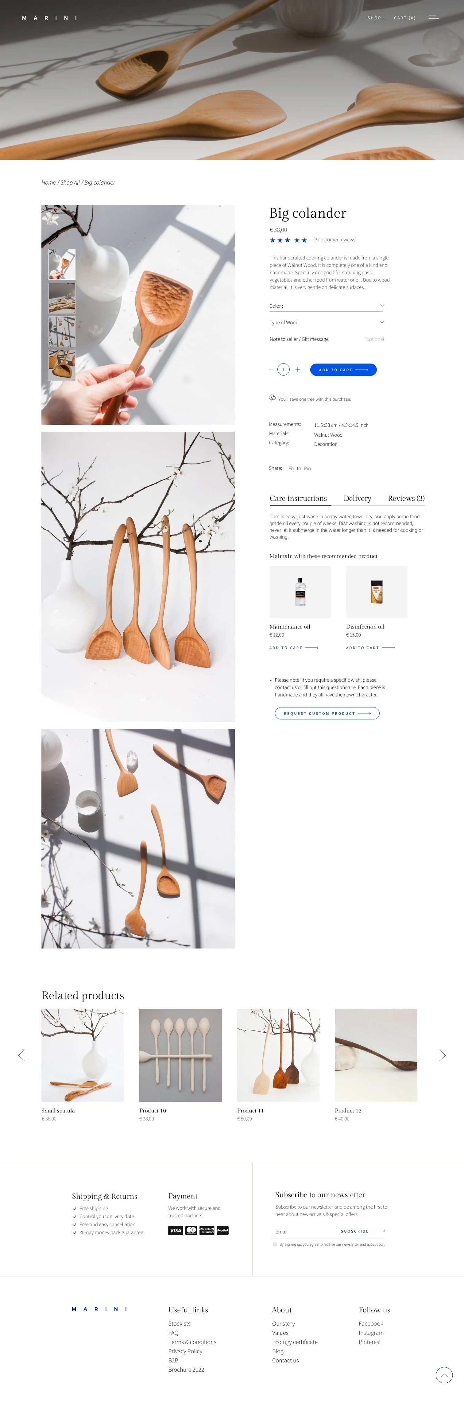
Product single page
In the next section, you can see some of the prototype animations I did.
The idea was to capture the flowing aspect of the wave which is part of the Marini logo and make the page elements seem more fluid and organic.

Conclusion
It was a really interesting project and I’m pleased with how much we were able to get done in a small amount of time.
This was my first contact with the Handmade industry and I learned a lot about wood processing, carving, and the ecological sustainability of a small business.
Special kudos to my team, I worked with fantastic people. As the project is still in progress I can’t wait for us to meet again and continue working on finalizing the Marini website.